library(quantmod)
#> Loading required package: xts
#> Loading required package: zoo
#>
#> Attaching package: 'zoo'
#> The following objects are masked from 'package:base':
#>
#>     as.Date, as.Date.numeric
#> Loading required package: TTR
#> Registered S3 method overwritten by 'quantmod':
#>   method            from
#>   as.zoo.data.frame zoo
price_aapl <- getSymbols("AAPL", auto.assign=FALSE, from="2020-01-01", to="2022-12-31")
head(price_aapl)
#>            AAPL.Open AAPL.High AAPL.Low AAPL.Close AAPL.Volume AAPL.Adjusted
#> 2020-01-02   74.0600   75.1500  73.7975    75.0875   135480400      72.96046
#> 2020-01-03   74.2875   75.1450  74.1250    74.3575   146322800      72.25114
#> 2020-01-06   73.4475   74.9900  73.1875    74.9500   118387200      72.82685
#> 2020-01-07   74.9600   75.2250  74.3700    74.5975   108872000      72.48434
#> 2020-01-08   74.2900   76.1100  74.2900    75.7975   132079200      73.65034
#> 2020-01-09 76.8100 77.6075 76.5500 77.4075 170108400 75.2147418 Basics of time series
18.1 Overview
In today’s data-driven world, decision-making relies heavily on data analysis. Often, we come across data that is recorded sequentially in time, called time-series data, that drives our decisions. For instance, as an investor, stock prices become a crucial factor influencing our buy or sell decisions. In this section, we will explore how to analyse time-series data using R, with stock prices as a case study.
Time-series data is collected sequentially over a specific time interval, such as daily, monthly, or yearly. When plotted, it shows patterns like trend, seasonality, or a combination of both. Identifying these patterns can help in making decisions. For instance, recognising a seasonal pattern in stock prices can aid in determining the optimal time to buy or sell. By decomposing the data in R, we can explore these patterns in detail.
Obtaining stock prices in R is easy using the quantmod package, which assists quantitative traders in exploring and building trading models. The package uses Yahoo Finance as its source of stock prices, so it’s essential to check the ticker of your stock before using it. In this article, we will analyze the stock prices of “Apple” (AAPL) from 2020 to 2022. However, note that stock price analysis is just one of several factors that influence investment decisions, and it’s crucial to consider other factors as well.
The ts class
The ts class is a built-in R class designed specifically for time-series data, and provides a convenient way to store and work with time-series objects. It allows users to perform various time-series operations, such as subsetting, aggregating, and plotting the data, as well as decomposing and forecasting the time-series. The ts class is widely used in the R community, and is an essential tool for any data analyst or researcher working with time-series data.
Basic time series plots using ts class
library(ggplot2)
library(plotly)
#>
#> Attaching package: 'plotly'
#> The following object is masked from 'package:ggplot2':
#>
#>     last_plot
#> The following object is masked from 'package:stats':
#>
#>     filter
#> The following object is masked from 'package:graphics':
#>
#>     layout

p <- autoplot(price_aapl$AAPL.Close, color = I("blue"))+
ggtitle("Apple, 2020-2022")+
xlab("Days")+
ylab("Stock Price")+
  theme_linedraw()

ggplotly(p)
Creating a time series object with ts()
library(ggfortify)
# Convert data_vector to a ts object with start = 2020 and frequency = 4
time_series <- ts(price_aapl$AAPL.Close, start = 2020, frequency = 252)

# View time_series
p <- autoplot(time_series, color = I("red"))+
ggtitle("Apple, 2020-2022")+
xlab("Days")+
ylab("Stock Price")+
  theme_linedraw()

ggplotly(p)
When working with time series data in R, it is important to define the frequency of the data. The frequency refers to the number of observations before the seasonal pattern repeats. Here the 252 days refers to the number of trading days in a year. If you want to use a ts object, then you need to decide which of these is the most important.
18.2 Basic time series models
18.2.1 White noise and random walk
Quite often, we may find stock prices are randomly fluctuating without any underlying trend or pattern. We call this phenomenon as white noise, it is a random process where the time series is uncorrelated and the variance is constant over time. In other words, the next value in the series is completely unpredictable and unrelated to the previous value. White noise is often used as a baseline for comparison when evaluating other time series models.
library(ggfortify)

# Simulate a WN model with list(order = c(0, 0, 0))
white_noise<- arima.sim(model = list(order = c(0, 0, 0)), n = 100)

# Plot the WN observations
p <- autoplot(white_noise, color = I("red"))+
ggtitle("White Noise")+
xlab("Time")+
ylab("Values")+
  theme_linedraw()

ggplotly(p)
On the other hand, a random walk is a stochastic process where the next value in the series is a random step from the previous value. In this model, the time series has no determinate trend or pattern, but there is a tendency for the price to drift up or down over time.
library(ggfortify)

# Generate a random walk model using arima.sim
random_walk <- arima.sim(model = list(order = c(0, 1, 0)), n = 100)

# Plot random_walk
p <- autoplot(random_walk, color = I("red"))+
ggtitle("Random Walk")+
xlab("Time")+
ylab("Values")+
  theme_linedraw()

ggplotly(p)
In the context of stock prices, a random walk would suggest that prices are unpredictable and that there is no reliable way to forecast future movements. This is because the future price depends only on the current price and a random step, and not on any other information or factors.
The White noise model is a stationary process model, which means its statistical properties such as mean, variance, and covariance remain constant over time. Such models are parsimonious and have distributional stability over time. Weak stationarity is a type of stationarity in which the mean, variance, and covariance remain constant over time. This property can be used to estimate the mean accurately using the sample mean. While many financial time series do not exhibit strict stationarity, they often show changes that are approximately stationary, with random oscillations around some fixed level known as mean-reversion.
The white noise and random walk models are related, with the latter being non-stationary. A mean-zero white noise process when cumulatively summed results in a random walk process, while a non-zero mean white noise process when cumulatively summed leads to a random walk process. Let’s see them in a plot.
library(cowplot)
library(ggfortify)
library(plotly)

# Use arima.sim() to generate white noise data
white_noise <- arima.sim(model = list(order = c(0, 0, 0)), n = 100)

# Use cumsum() to convert your white noise data to a random walk
random_walk <- ts(cumsum(white_noise))

# Use arima.sim() to generate white noise drift data
wn_drift <- arima.sim(model = list(order = c(0, 0, 0)), n = 100, mean = 0.4)

# Use cumsum() to convert your white noise drift data to random walk
rw_drift <- ts(cumsum(wn_drift))

# Plot all four data objects
p1 <- autoplot(white_noise, color = I("red"))+
ggtitle("White Noise")+
xlab("Time")+
ylab("Values")+
  theme_linedraw()

p2 <- autoplot(random_walk, color = I("red"))+
ggtitle("White Noise Data to Random Walk")+
xlab("Time")+
ylab("Values")+
  theme_linedraw()

p3 <- autoplot(wn_drift, color = I("red"))+
ggtitle("White Noise Drift Data")+
xlab("Time")+
ylab("Values")+
  theme_linedraw()

p4 <- autoplot(rw_drift, color = I("red"))+
ggtitle("White Noise Drift Data to Random Walk")+
xlab("Time")+
ylab("Values")+
  theme_linedraw()

plot_grid(p1, p2, p3, p4, cols = 1)
#> Warning in plot_grid(p1, p2, p3, p4, cols = 1): Argument 'cols' is
#> deprecated. Use 'ncol' instead.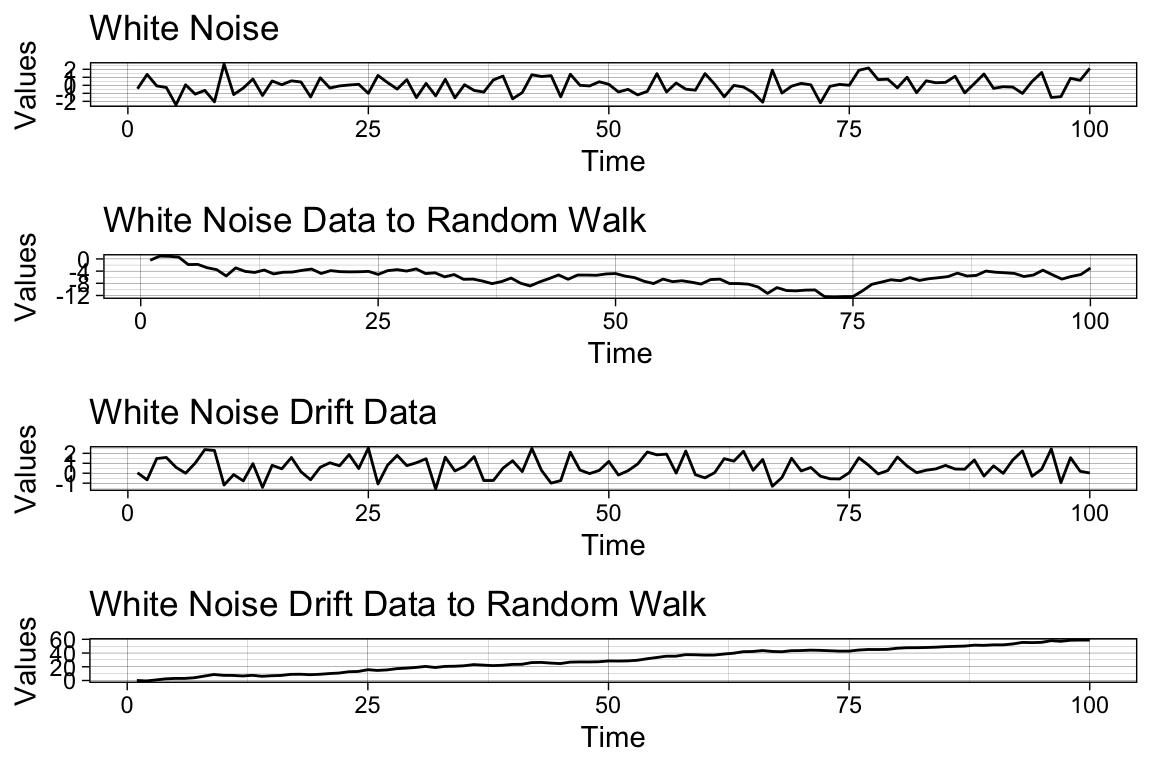
As you can see, it is easy to reverse-engineer the random walk data by simply generating a cumulative sum of white noise data.
Example: characteristics of financial time series
Scatterplots are used in financial time series analysis to understand the relationship between asset prices and returns. The primary goal of investing is to make a profit, and returns measure the changes in price relative to the initial price over a given period.
library(ggfortify)

# Use this code to convert prices to daily returns, the sequence length is 756 trading days
returns <- time_series[-1,] / time_series[-756,] - 1

# Convert returns to ts
returns <- ts(returns, start = c(2020, 0), frequency = 252)

# Plot returns
p <- autoplot(returns, color = I("red"))+
ggtitle("Returns")+
xlab("Time")+
ylab("Values")+
  theme_linedraw()

ggplotly(p)
Log returns, also known as continuously compounded returns, are commonly used in financial time series analysis. They are the log of gross returns, which are the changes or first differences in the logarithm of prices. The difference between daily prices and returns is substantial, while the difference between daily returns and log returns is usually small. One advantage of using log returns is that calculating multi-period returns from individual periods is simplified as they can be added together.
library(ggfortify)

# Use this code to convert prices to log returns
logreturns <- diff(log(time_series))

# Plot logreturns
p <- autoplot(logreturns, color = I("red"))+
ggtitle("Log Returns")+
xlab("Time")+
ylab("Values")+
  theme_linedraw()

ggplotly(p)
Daily net returns and daily log returns are two valuable metrics for financial data.
library(ggplot2)
library(plotly)

apple_percentreturns <- returns * 100

apple_df <- data.frame(Y=as.matrix(apple_percentreturns), date=time(apple_percentreturns))

# Display a histogram of percent returns
p <- ggplot(apple_df) +
  aes(x = Y) +
  geom_histogram(aes(y = ..density..), bins = 50L,
                     fill = "white", colour = 1) +
      theme_linedraw() +
  geom_density(lwd = 1, colour = 4, fill = 4, alpha = 0.25) +
  labs(
    x = "Percentage Returns",
    y = "Frequency",
    title = "Histogram of Apple Percentage Returns"
  )

ggplotly(p)
#> Warning: The dot-dot notation (`..density..`) was deprecated in ggplot2 3.4.0.
#> ℹ Please use `after_stat(density)` instead.
#> ℹ The deprecated feature was likely used in the ggplot2 package.
#>   Please report the issue at <https://github.com/tidyverse/ggplot2/issues>.
The average daily return for AAPL is about 0.09% over the last 3 years with a standard deviation as high as 2.32%. We are able to check the normality of the distribution using the normal quantile plots:
library(ggplot2)
library(plotly)

p <- ggplot(apple_df, aes(sample = Y)) +
      stat_qq() +
      stat_qq_line() +
      theme_minimal()

ggplotly(p)
#qqnorm(apple_percentreturns)
#qqline(apple_percentreturns)
Note that the vast majority of returns are near zero, but some daily returns are greater than 5 percentage points in magnitude. Similarly, note the clear departure from normality, especially in the tails of the distributions, as evident in the normal quantile plots.
There are different types of patterns that may appear in time series data. Some data may not have a clear trend, while others may exhibit linear, positive or negative autocorrelation, rapid growth or decay, periodicity, or changes in variance. To analyse and model time series data, it is often necessary to apply transformations to remove or adjust for these patterns.
18.3 Models with seasonal trend
Differencing is a useful technique for removing trends in a time series. It involves calculating the changes between successive observations over time. The first difference, or change series, can be obtained in R using the diff() function. This series allows for the examination of the increments or changes in a given time series and always has one fewer observations than the original series. By removing the linear trend, differencing can help to stabilise the level of a time series.
# Generate the first difference of apple time_series
dz <- diff(time_series)

# Plot dz
p <- autoplot(dz, color = I("red"))+
ggtitle("First Difference")+
xlab("Time")+
ylab("Values")+
  theme_linedraw()

ggplotly(p)
By removing the long-term time trend, you can view the amount of change from one observation to the next.
Seasonal trends can be removed by applying seasonal differencing to time series. Seasonal patterns can be seen in time series data that exhibit a strong pattern that repeats every fixed interval of time, such as a yearly or quarterly cycle. Seasonal differencing is applied to remove these periodic patterns. This method is useful when changes in behaviour from year to year may be more important than changes from month to month, which may largely follow the overall seasonal pattern. The function diff(..., lag = s) can be used to calculate the lag s difference or length s seasonal change series. An appropriate value of s for monthly or quarterly data would be 12 or 4, respectively. The diff() function defaults to a lag of 1 for first differencing. The seasonally differenced series will have s fewer observations than the original series.
# Generate a diff of time_series with n = 30. Save this to dx
dx <- diff(time_series, lag = 30)

# Plot dx
p <- autoplot(dx, color = I("red"))+
ggtitle("Difference in Time Series with n = 30")+
xlab("Time")+
ylab("Values")+
  theme_linedraw()

ggplotly(p)
Once again differencing allows you to remove the longer-term time trend - in this case, seasonal volatility - and focus on the change from one month to another.
Autocorrelation is a statistical method used in time series analysis to identify patterns of dependence between observations separated by a given lag. In other words, autocorrelation measures the degree to which a time series is correlated with itself at different time lags. It can be used to identify the presence of trends, seasonality, and other patterns in time series data. It is an important tool in understanding the behaviour of time series data and can be used to develop models for forecasting future values of the series.
To assess the relationship between a time series and its past, autocorrelations can be estimated at different lags. The acf() function can estimate autocorrelations from lag 0 up to a specified value using the lag.max argument. The acf() function can also be used to explore other applications. Let’s see in action:
#Assesing the autocorrelation upto 100 lags.
aapl_acf <- acf(returns, lag.max = 100, plot = FALSE)

p <- autoplot(aapl_acf, color = I("red"))+
ggtitle("ACF")+
xlab("Lag")+
ylab("Values")+
  theme_linedraw()

ggplotly(p)
In this example, we can see the value of return is most correlated with the return one day before, and drops quick to approximately zero. A zero autocorrelation means that the series is random and that there is no pattern or trend in its evolution. On the other hand, if we observe a positive autocorrelation, it will indicate that the series is positively correlated with its lagged values, while a negative autocorrelation indicates that the series is negatively correlated with its lagged values.
To apply autocorrelation and differencing, there are several types of models that can be used . Three popular types of time series models are the Autoregressive (AR) model, the Moving Average (MA) model, and the Autoregressive Integrated Moving Average (ARIMA) model.
The Autoregressive (AR(p)) model is defined as:
\[ x_t = \phi_1 x_{t-1} + \phi_2 x_{t-2} + \cdots + \phi_p x_{t-p} + w_t, \]
where \(x_t\) is the value of the time series at time \(t\), \(w_t\) is the error term at time \(t\), and \(\phi_1, \phi_2, \cdots, \phi_p\) are the autoregressive coefficients. The parameter \(p\) is the order of the AR model. This equation represents the linear relationship between the current value of the time series and its past values, where the value at each lag is weighted by its corresponding coefficient. The error term accounts for any unexplained variation in the time series that is not accounted for by the AR terms. The AR model is widely used in time series analysis, and it is a special case of the more general ARIMA models.
In R, the arima() function can also be used to estimate an AR model. To estimate an AR(p) model, you can set the order parameter to c(p,0,0)
Here’s a breakdown of the output:
Coefficients: the estimated coefficients for the AR model. In this case, the model has one AR term, represented asar1, and an intercept term. The value ofar1is -0.1507, indicating a negative correlation between the current value of the time series and its past value. The intercept term is 1e-03, which represents the estimated mean of the returns.s.e.: the standard errors of the estimated coefficients.sigma^2 estimated as: the estimated variance of the error term in the AR model. In this case, the estimated value is 0.0005284.log likelihood: the log-likelihood of the estimated model, which is a measure of how well the model fits the data. In this case, the log-likelihood is 1777.18.aic: the Akaike Information Criterion (AIC) of the estimated model, which is a measure of the model’s quality that balances the goodness of fit and the model complexity. The lower the AIC, the better the model. In this case, the AIC is -3548.37.
The second model is the moving average (MA(q)) model, which is defined as:
\[ x_t = w_t + \theta_1 w_{t-1} + \theta_2 w_{t-2} + \cdots + \theta_q w_{t-q}, \]
where \(x_t\) is the value of the time series at time \(t\), \(w_t\) is the error term at time \(t\), and \(\theta_1, \theta_2, \cdots, \theta_q\) are the moving average coefficients. The parameter \(q\) is the order of the MA model. This equation represents the linear relationship between the current value of the time series and its past error terms, where the value at each lag is weighted by its corresponding coefficient. The error term accounts for any unexplained variation in the time series that is not accounted for by the MA terms.
In this case, the model has two MA terms, represented as ma1 and ma2, and an intercept term. The value of ma1 is -0.1495 and ma2 is 0.0189, indicating a negative correlation between the current value of the time series and its past two error terms.
Finally, the Autoregressive Integrated Moving Average (ARIMA) is a model that combines the autoregressive (AR) model, the moving average (MA) model, and differencing to handle non-stationary data. It can be used for time series analysis, forecasting, and modelling various economic, financial, and scientific phenomena. The ARIMA(p,d,q) model is defined as:
\[\left(1 - \sum_{i=1}^{p} \phi_i L^i\right)(1 - L)^d x_t = \left(1 + \sum_{i=1}^{q} \theta_i L^i\right) w_t,\]
where \(x_t\) is the value of the time series at time \(t\), \(w_t\) is the error term at time \(t\), \(L\) is the lag operator such that \(L^i x_t = x_{t-i}\), and \(\phi_i\), \(\theta_i\) are the AR and MA coefficients, respectively. The parameter \(p\) is the order of the AR component, \(d\) is the degree of differencing, and \(q\) is the order of the MA component.
We can see the model has one AR term, represented as ar1, one MA term, represented as ma1, and no intercept term. The value of ar1 is -0.1514, indicating a negative correlation between the current value of the time series and its past value up to 1 lag. The value of ma1 is -0.9961, indicating a strong negative correlation between the current value of the time series and its past error term.
18.4 AR model estimation and forecasting **
In this section, we will explore a new example from the R base library - the AirPassengers dataset. AirPassengers is a pre-existing time series dataset in R, which includes the monthly total number of airline passengers from January 1949 to December 1960. The dataset is organised as a time series object in R, where the passenger counts represent the data and the time index represents the time dimension.
p <- autoplot(AirPassengers, geom = "line") +
      labs(x="Time", y ="Passenger numbers ('000)", title="Air Passengers from 1949 to 1961") +
      theme_minimal()
ggplotly(p)
Compare to the AAPL stock price series, the AirPassengers is a stationary time series with predictable pattern. To test whether a time series is a random walk, you can perform an augmented Dickey-Fuller (ADF) test. The ADF test is a statistical hypothesis test that tests whether a unit root is present in a time series, which is a key characteristic of a random walk process. For example, for the AAPL series, we have:
The p-value is greater than the significance level of 0.05, which suggests that there is not enough evidence to reject the null hypothesis that the data has a unit root and is non-stationary (i.e., is a random walk process). On the other hand:
adf.test(AirPassengers)
#> Warning in adf.test(AirPassengers): p-value smaller than printed p-value
#>
#>  Augmented Dickey-Fuller Test
#>
#> data:  AirPassengers
#> Dickey-Fuller = -7.3186, Lag order = 5, p-value = 0.01
#> alternative hypothesis: stationary
We can reject the null hypothesis as p-value < 0.05 and confirm the AirPassengers series is not a random walk.
Now, let’s fit a simple AR model:
We can plot the fitted value with the true value of the time series as using the following codes, where the red dots are the fitted values and black lines are the observed values.
ts.plot(AirPassengers)
AR_fitted <- AirPassengers - residuals(AR)
points(AR_fitted, type = "l", col = 2, lty = 2)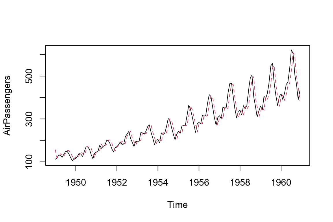
Fitting an AR model to the AirPassengers data in a reproducible fashion has allowed us to successfully model the data. This model can be used to predict future observations based on the fitted AR data.
# Use predict() to make forecast for next 10 steps
predict(AR, n.ahead = 10)
#> $pred
#>           Jan      Feb      Mar      Apr      May      Jun      Jul      Aug
#> 1961 426.5698 421.3316 416.2787 411.4045 406.7027 402.1672 397.7921 393.5717
#>           Sep      Oct
#> 1961 389.5006 385.5735
#>
#> $se
#>           Jan      Feb      Mar      Apr      May      Jun      Jul      Aug
#> 1961 33.44577 46.47055 55.92922 63.47710 69.77093 75.15550 79.84042 83.96535
#>           Sep      Oct
#> 1961 87.62943 90.90636
We can plot the forecasted value with the standard error as:
# Run to plot the Nile series plus the forecast and 95% prediction intervals
ts.plot(AirPassengers, xlim = c(1955, 1962))
AR_forecast <- predict(AR, n.ahead = 10)$pred
AR_forecast_se <- predict(AR, n.ahead = 10)$se
points(AR_forecast, type = "l", col = 2)
points(AR_forecast - 2*AR_forecast_se, type = "l", col = 2, lty = 2)
points(AR_forecast + 2*AR_forecast_se, type = "l", col = 2, lty = 2)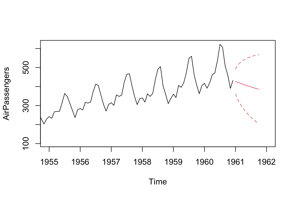
Based on the data available, the predictions for the period from Jan to Oct 1961 looks only captures the decline in the first month and assuming the decline will continue. The wider confidence band (represented by dotted lines) is a reflection of the low persistence in the AirPassengers data. We are able to improve the model by increasing the number of AR terms:
AR = arima(AirPassengers, order = c(5, 0, 0))
print(AR)
#>
#> Call:
#> arima(x = AirPassengers, order = c(5, 0, 0))
#>
#> Coefficients:
#>          ar1      ar2     ar3      ar4     ar5  intercept
#>       1.3062  -0.5299  0.1417  -0.1779  0.2407   289.3494
#> s.e.  0.0814   0.1385  0.1465   0.1405  0.0862    95.8814
#>
#> sigma^2 estimated as 889.9:  log likelihood = -695.12,  aic = 1404.24
ts.plot(AirPassengers, xlim = c(1955, 1962))
AR_forecast <- predict(AR, n.ahead = 10)$pred
AR_forecast_se <- predict(AR, n.ahead = 10)$se
points(AR_forecast, type = "l", col = 2)
points(AR_forecast - 2*AR_forecast_se, type = "l", col = 2, lty = 2)
points(AR_forecast + 2*AR_forecast_se, type = "l", col = 2, lty = 2)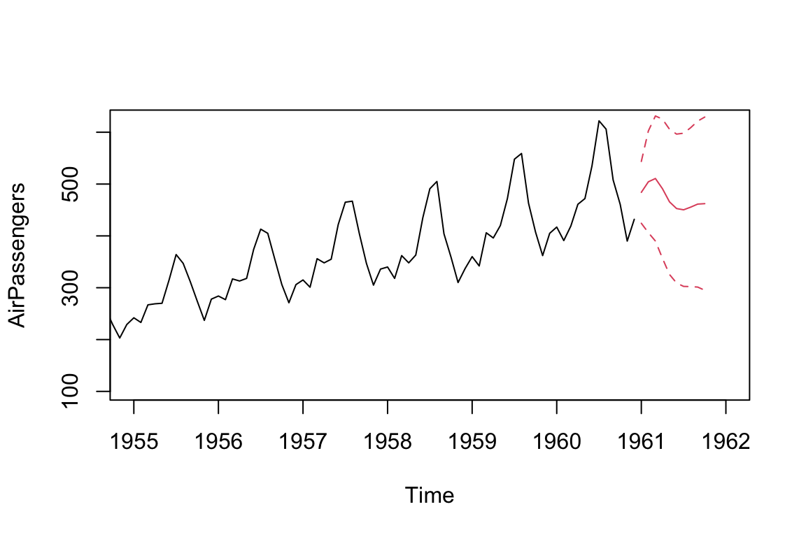
We can see an improvement of log likelihood by increasing the number of AR terms from 1 to 5.
The forecasted trend is also more reasonable, which resembles the pattern of the previous observed trends.
Now lets compare the AR model with a simple MA model:
MA = arima(AirPassengers, order = c(0, 0, 5))
print(MA)
#>
#> Call:
#> arima(x = AirPassengers, order = c(0, 0, 5))
#>
#> Coefficients:
#>          ma1     ma2     ma3     ma4     ma5  intercept
#>       1.7132  1.9434  1.9189  1.7217  0.9097   283.1498
#> s.e.  0.0715  0.1081  0.1076  0.1193  0.0815    22.0011
#>
#> sigma^2 estimated as 850.1:  log likelihood = -697.37,  aic = 1408.75
ts.plot(AirPassengers, xlim = c(1955, 1962))
MA_forecast <- predict(MA, n.ahead = 10)$pred
MA_forecast_se <- predict(MA, n.ahead = 10)$se
points(MA_forecast, type = "l", col = 2)
points(MA_forecast - 2*MA_forecast_se, type = "l", col = 2, lty = 2)
points(MA_forecast + 2*MA_forecast_se, type = "l", col = 2, lty = 2)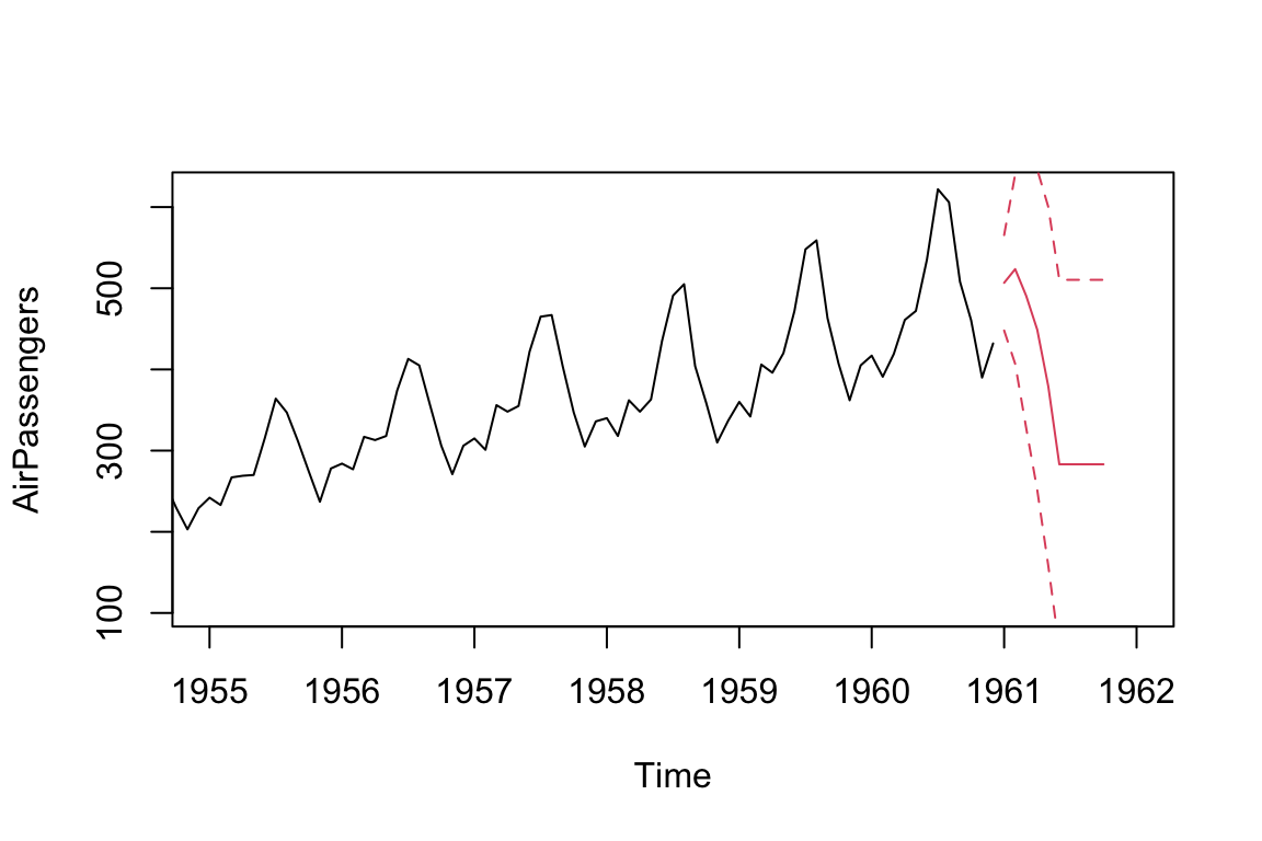
Note that the MA model can only produce a q-step forecast (where q is the MA component of the MA model). For additional forecasting periods, the predict() command simply extends the original q-step forecast. This explains the unexpected horizontal lines after Jun 1961.
Compare AR and MA models Comparing AR and MA models involves assessing their goodness of fit using information criterion measures in model fitting outputs. The lower the AIC values, the better the fit of the model.
Autoregressive (AR) and Moving Average (MA) are two popular methods for modelling time series. To determine which model is more appropriate in practice, you can calculate the AIC values for each model. These measures penalise models with more estimated parameters to avoid overfitting, and smaller values are preferred. If all other factors are equal, a model with a lower AIC value than another model is considered to be a better fit.
Although the predictions from both models are very similar (indeed, they have a correlation coefficient of 0.92), the AIC indicate that the AR model is a slightly better fit for the AirPassengers data.
cor(AR_forecast, MA_forecast)
#> [1] 0.9233236
18.4.1 Advanced time series analytics in R
If you’re interested in further exploring time series analysis in R, here are some recommendations for next steps:
Explore more advanced time series models: In addition to the basic models covered in this course, there are many more advanced time series models available in R, such as Seasonal ARIMA, Vector Autoregression (VAR), and Dynamic Factor Models.
Incorporate external variables: Time series data can often be affected by external variables, such as holidays or economic events. Consider learning how to incorporate external variables into your time series models using techniques like regression with ARIMA errors or vector autoregression (VAR).
Consider machine learning approaches: In addition to traditional time series models, machine learning techniques such as neural networks, random forests, and support vector machines can also be used for time series forecasting.